Kononenko
Kononenko’s architecture portfolio connects houses, hotels and larger developments with the sketches, planning and people behind them.


About Kononenko
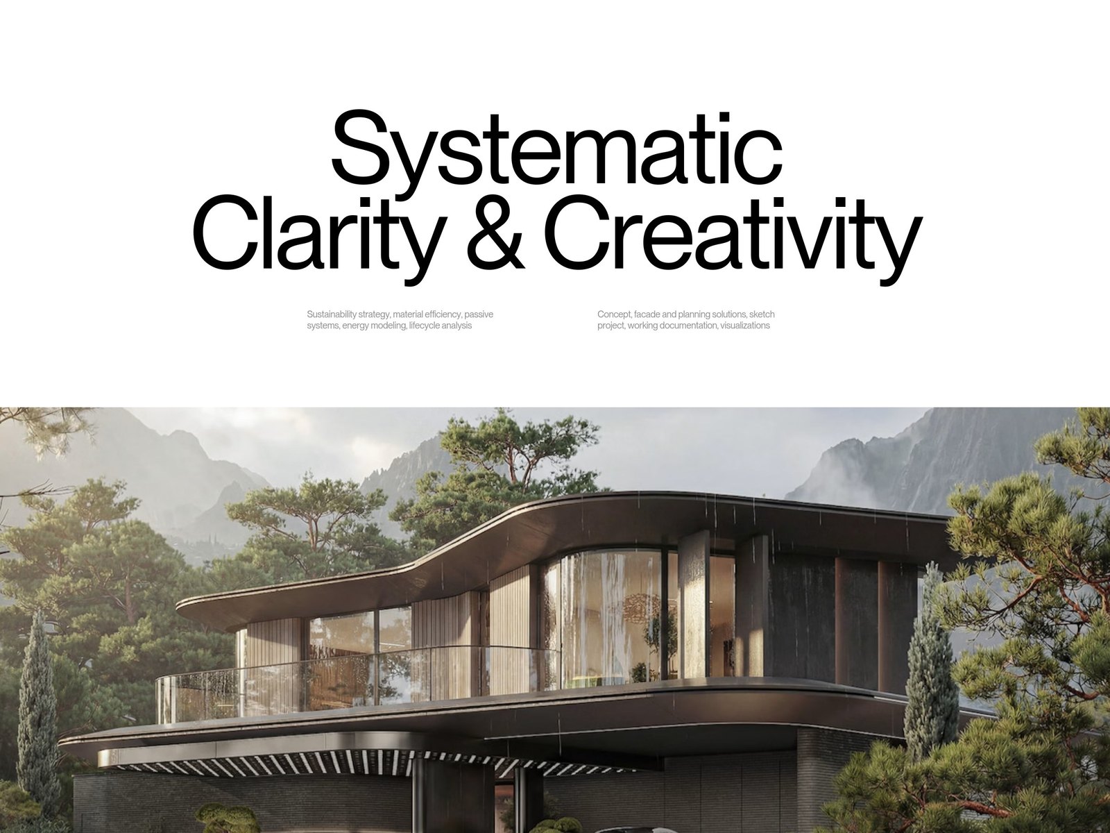
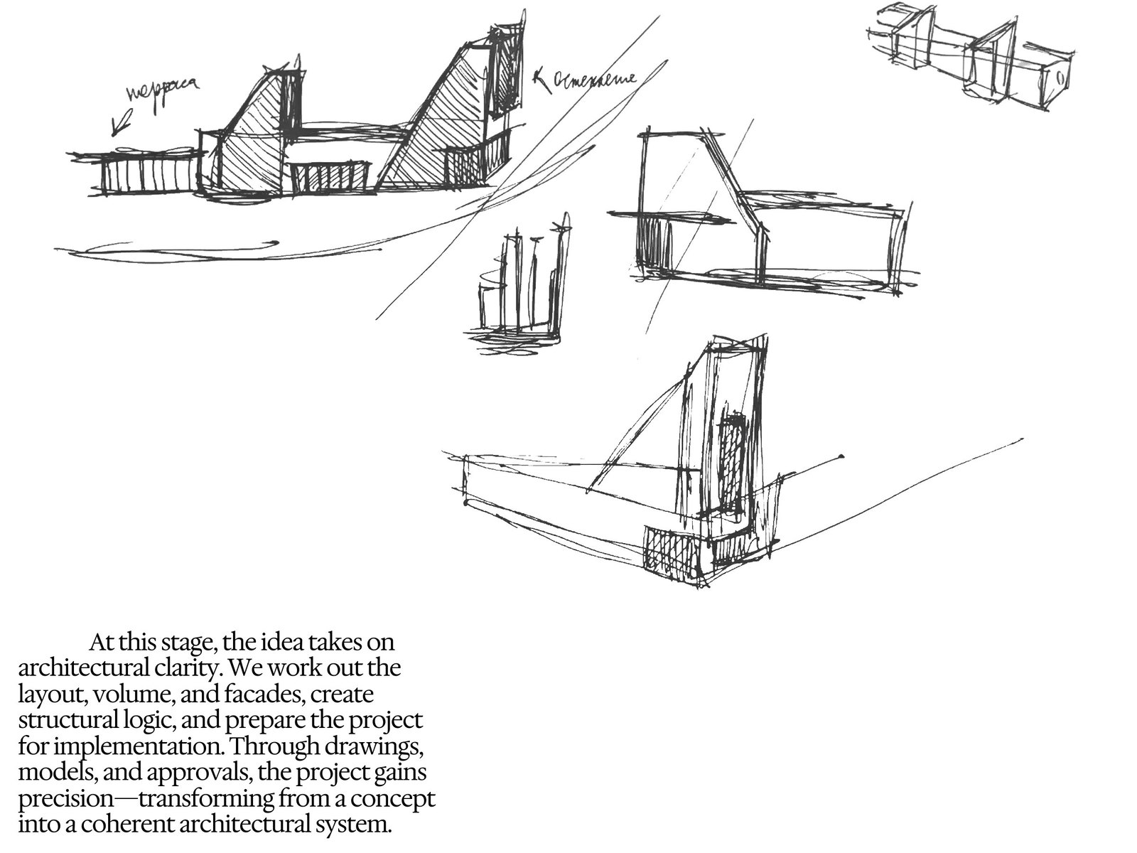
Large architectural photographs introduce Kononenko’s work before the site turns to how it is developed. Sketches, diagrams and project narratives connect the finished buildings to decisions about space, materials and structure.
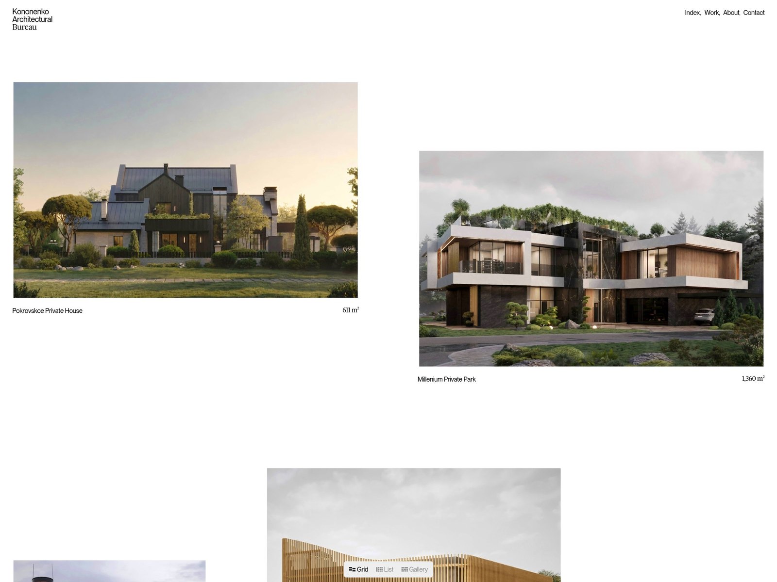
Selected projects range from private houses to hotels and residential schemes, with floor areas and individual case studies giving each a sense of scale. Studio history and team profiles place that work alongside the people and process behind it.
Color palette
Typography
Website details
/frontpage, /work, /about, /contact & more.
Project cards link to individual case studies, while the Work index provides a separate route through the portfolio. The footer includes a direct team link, telephone and email links, and the studio’s social channels.
Architectural photographs, sketches and diagrams accompany project names and floor areas. The homepage also presents the bureau’s development process, team portraits, awards and publications.
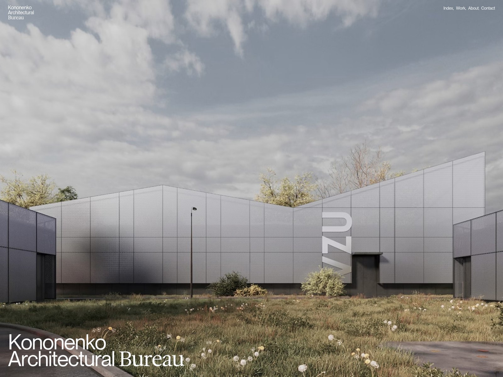
PP Neue Montreal is used for the main sans-serif headings and navigation, paired with Hedvig Letters Serif for contrasting labels and editorial passages. Black text and restrained pale surfaces frame the large architectural images. The homepage places small white navigation at the corners and its title at the lower left of a full-bleed architectural photograph.
The mobile homepage keeps Work, About and Contact as direct links beside the compact wordmark. The opening photograph fills a tall frame, with a smaller two-line project identity near its lower edge.
The site is built with Nuxt. Its project pages and studio sections sit within the same custom portfolio, rather than a separately embedded gallery.