


Start with the job the page is doing
A good reference is not a set of pixels to reproduce. It is evidence of a decision. Before saving a screenshot, write down what the page needs a visitor to understand or do. Is it introducing a studio, explaining a complex product, or making a single project memorable? Two pages can look similar while solving very different problems.
Give every reference a one-sentence brief. For example: “This homepage makes a small body of work feel considered through generous pacing.” That sentence is more useful than a folder named “nice websites,” because it gives you a criterion for choosing what to keep.
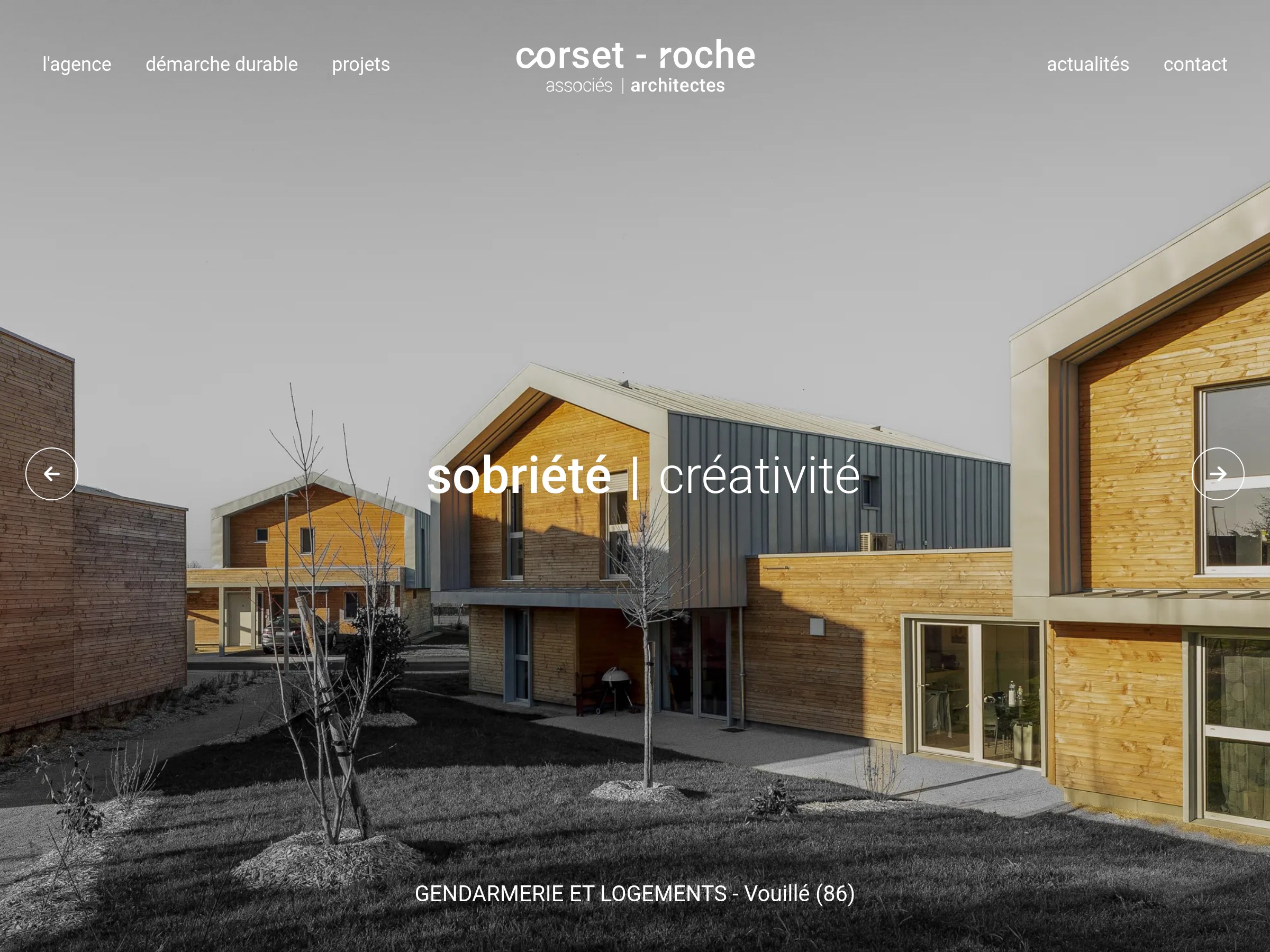
Separate the principle from the execution
Describe a useful pattern without naming its font, color or exact layout. “The hero gives the project image room to breathe” is a principle. “Use this exact 72-pixel headline over the same crop” is an execution. A principle can be transferred to new content; an execution usually cannot.
Try making three observations per reference: what catches your eye first, what keeps you moving, and what helps you decide where to go next. If you cannot answer those questions, the reference may be attractive but not useful for your current brief.
| Observe | Ask | Adapt |
|---|---|---|
| Hierarchy | What is noticed first? | Set a clear visual priority for your own content. |
| Rhythm | Where does the page slow down? | Vary density according to the story you need to tell. |
| Interaction | What does movement explain? | Use motion only when it clarifies a change or action. |
Build a moodboard of decisions, not screenshots
A useful moodboard contains a small number of references with annotations. Group them by the problem they solve: opening statement, project navigation, long-form reading, responsive image treatment or closing call to action. Keep contradictory examples side by side. Seeing two good solutions to the same problem makes copying either one less tempting.
For each group, write what your own page must do differently. Different content length, audience, image quality and device mix should change the design. If a reference only works with photography you do not have, borrow its pacing rather than its image-led composition.
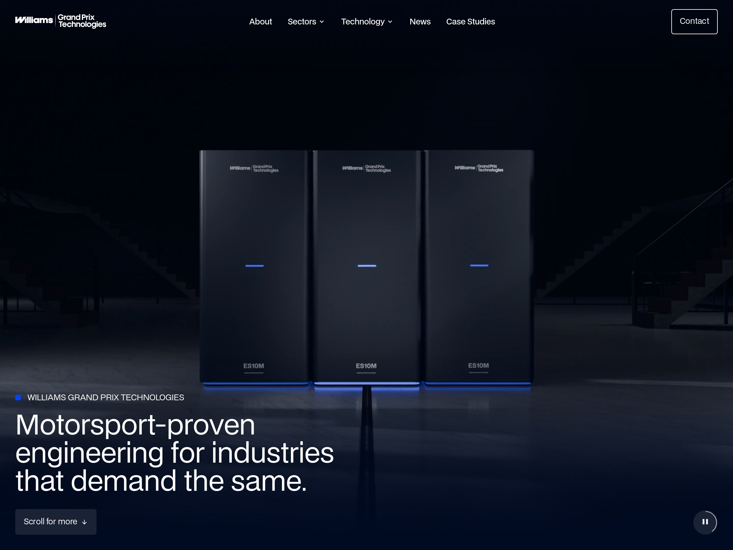
Prototype the relationship, then change the materials
Sketch the proportions and sequence in low fidelity. Replace the source copy, imagery and brand colors immediately with your own. The early prototype should answer structural questions: is the first screen clear, does the page maintain momentum, and can a visitor find the next step?
Finally, compare the finished work with the reference at arm’s length. If the silhouette, timing and memorable details still feel identical, push further. Originality often comes from responding honestly to your own content and constraints, not from inventing an unfamiliar layout for its own sake.