

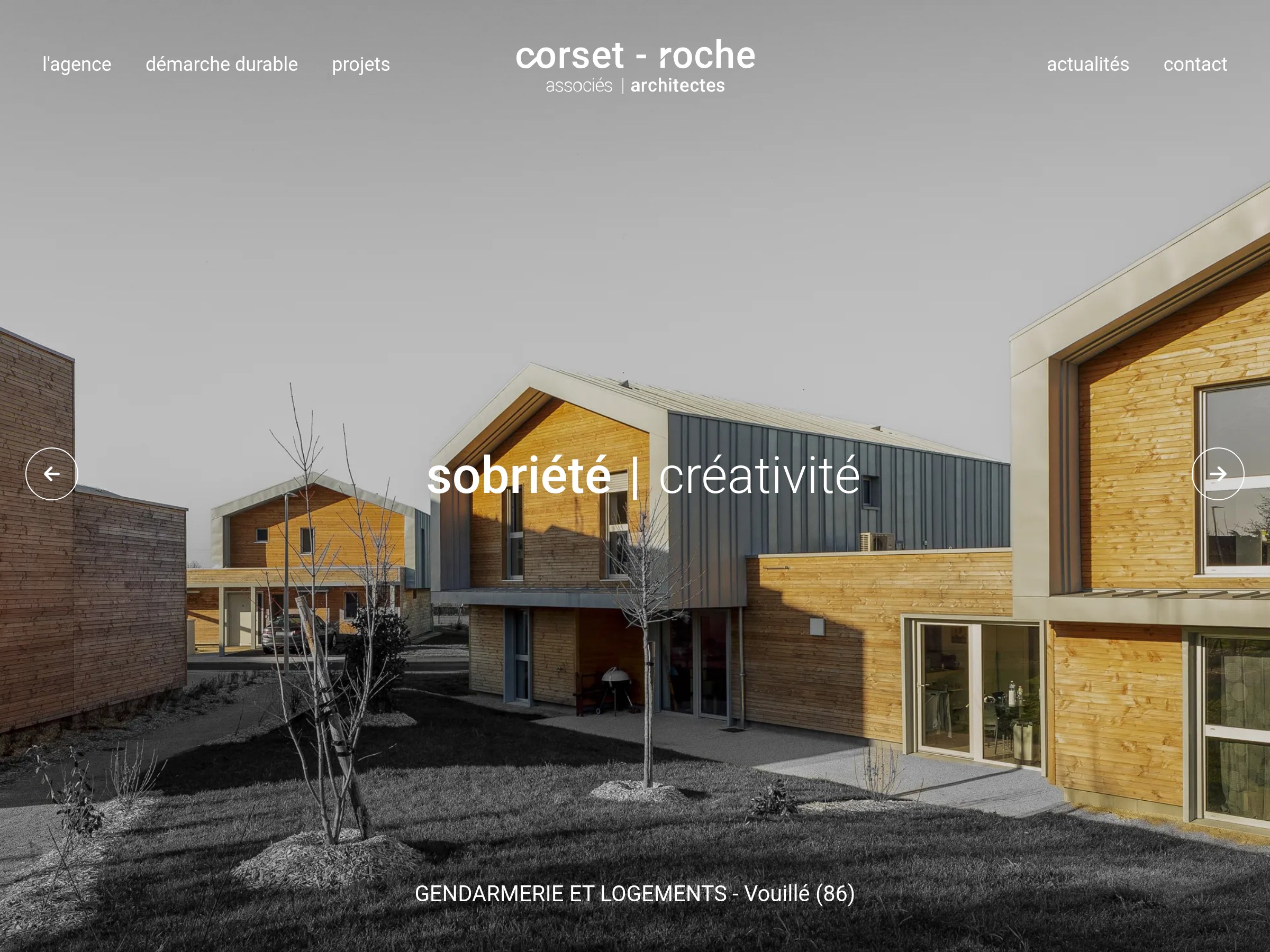
Begin with a question, not a collection
A moodboard becomes useful when it answers a design question. “How might we present a small portfolio with confidence?” is a better starting point than “minimal websites.” Write the question at the top of the board and keep it visible while collecting. It will help you reject beautiful examples that do not serve the project.
Collect fewer references than you think you need. Five annotated examples can reveal more than fifty unlabeled screenshots. Include at least one reference outside the project’s immediate category; a museum, product interface or editorial publication may solve a familiar problem in a less predictable way.
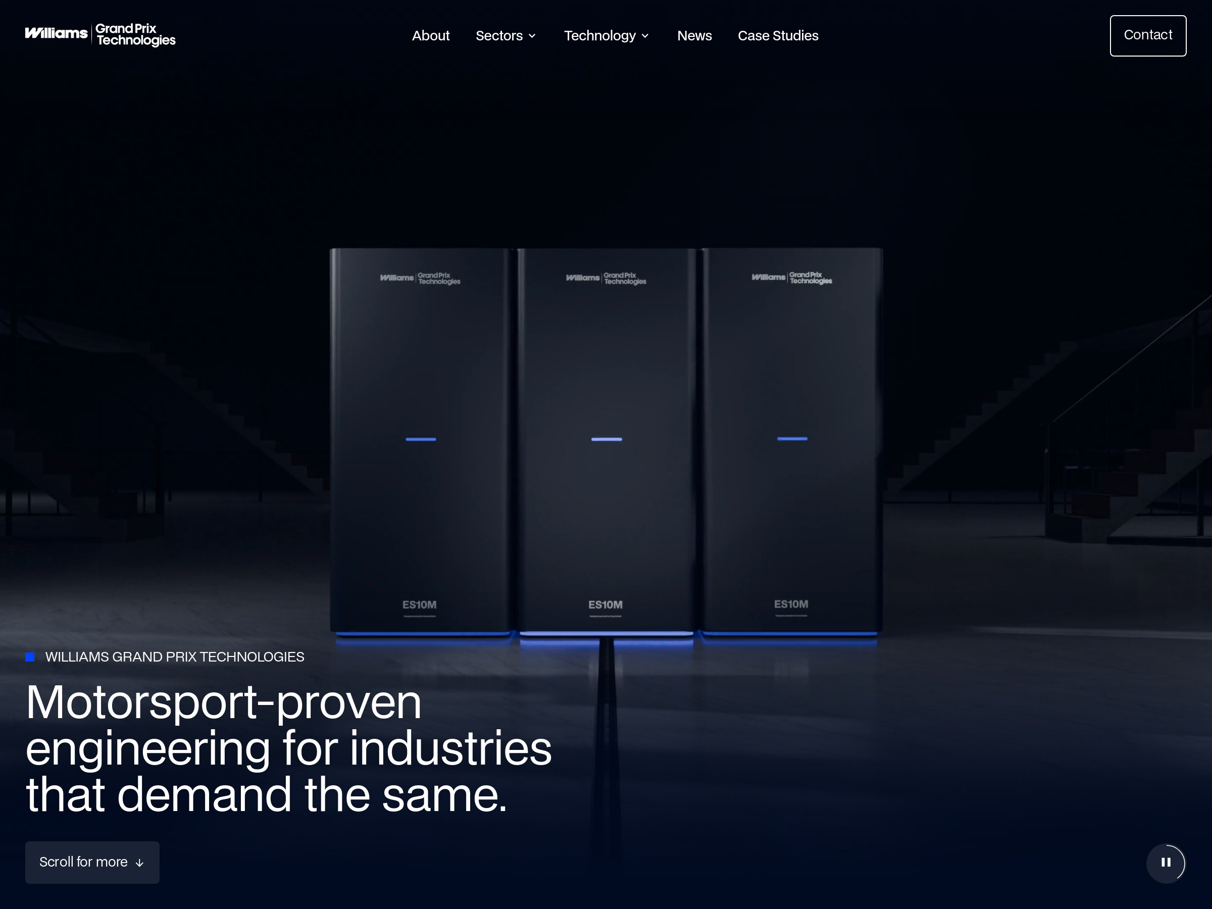
Sort references by what they help you decide
Useful categories describe functions: first impression, navigation, project storytelling, reading experience, responsive behavior and closing action. A single website may appear in more than one category, but each appearance should have its own note.
For each reference, write one observation and one limitation. The limitation is important: it tells you where the example stops being relevant. A dramatic full-screen photograph may set a memorable tone, but it is not a suitable model if your client has only a handful of inconsistent images.
| Group | Save | Write down |
|---|---|---|
| Opening | A first-screen composition | What is understood in five seconds? |
| Reading | A longer page section | How are pauses and emphasis created? |
| Navigation | A route through the site | Why is the next step obvious? |
| Mobile | A narrow-screen state | What changes instead of merely shrinking? |
Translate the board into rules for your project
Once the board is grouped, look for recurring relationships. Perhaps wide imagery consistently follows short passages, or supporting information is quieter than project titles. Turn these into a small set of working rules, then test them with your own copy and images.
Do not turn the moodboard into a component library too early. A moodboard is a tool for direction; the actual design system should emerge from the project’s content, accessibility needs and interaction patterns. If a rule fails when applied to a real page, change the rule.
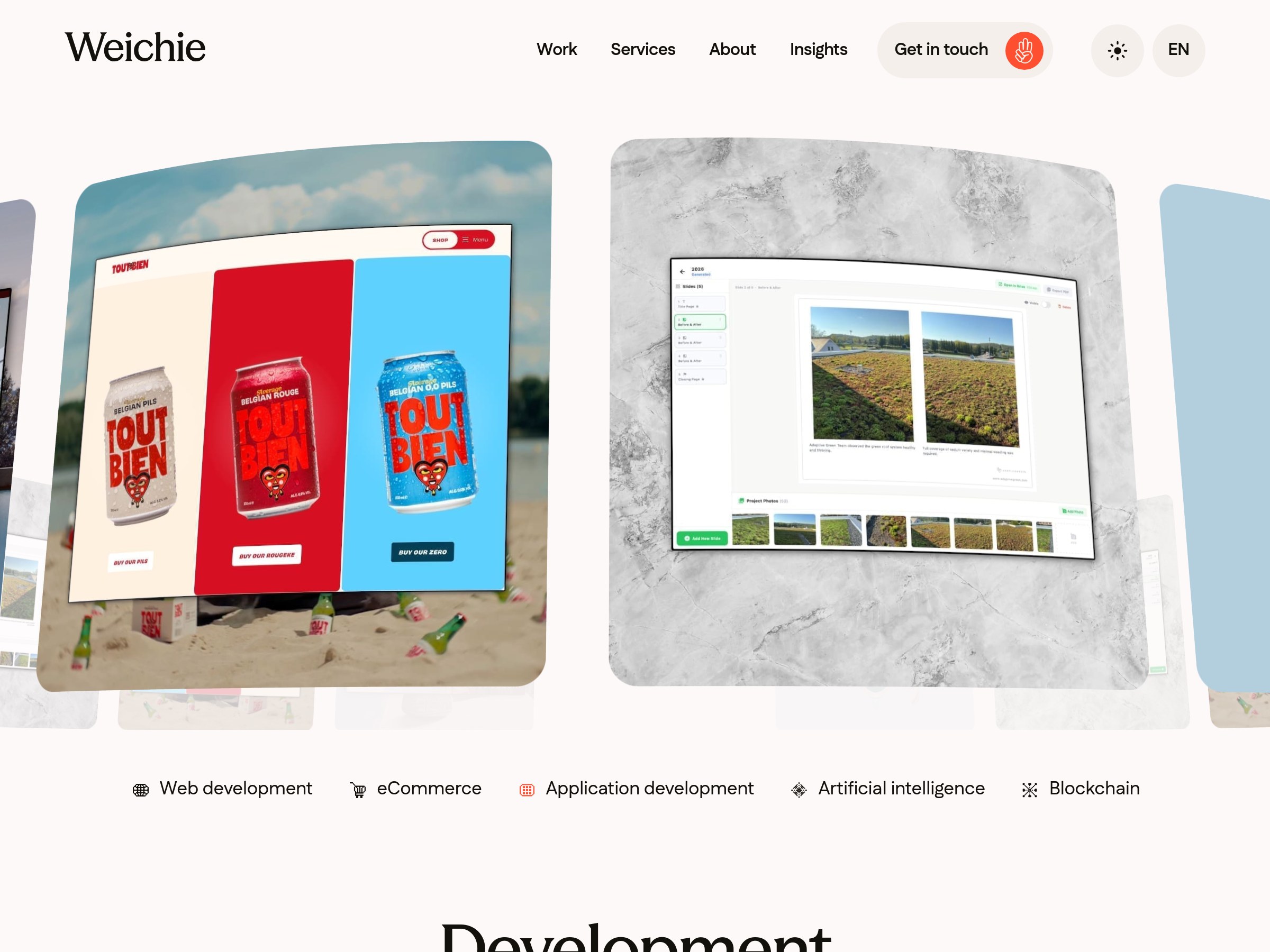
Keep the evidence, discard the imitation
Review the final design against the brief, not against a screenshot. Ask whether the hierarchy works, the content is easy to scan, and the next action is clear. Keep the reference notes for explaining decisions to collaborators, but remove the original imagery and styling from the production design.
The best moodboard is not the prettiest board. It is the one that helps a team make fewer arbitrary choices and gives the finished site a point of view of its own.